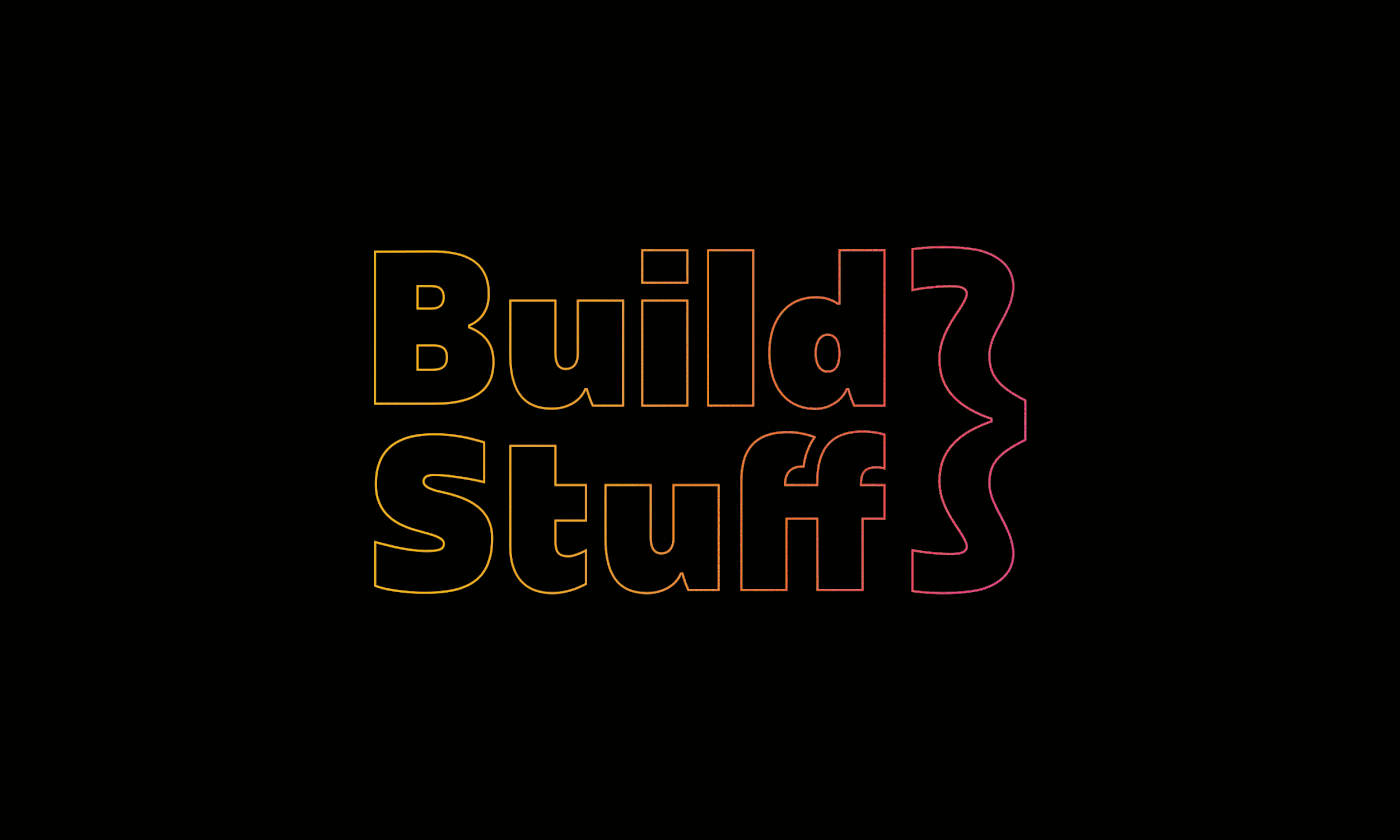
Build Stuff
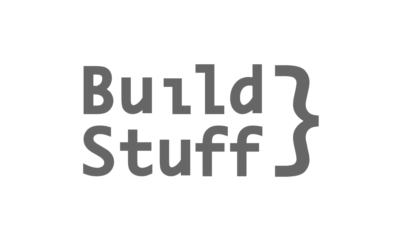
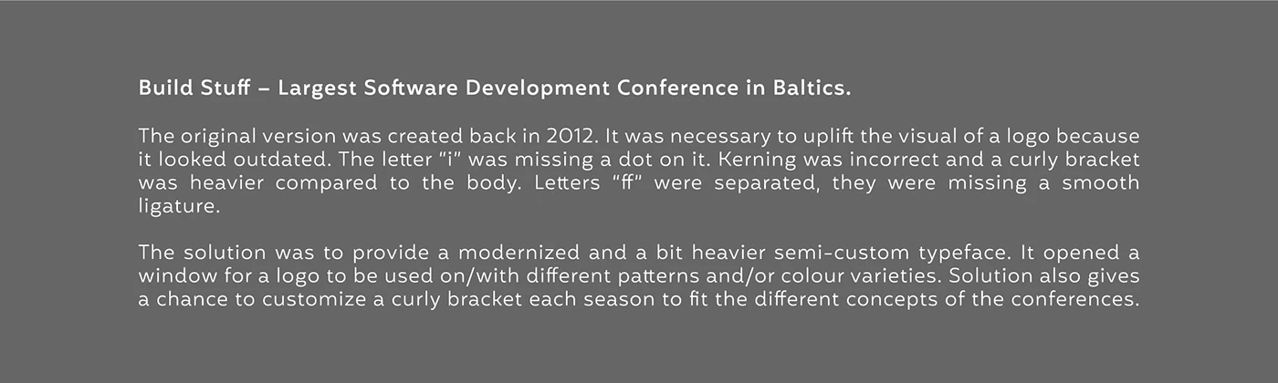
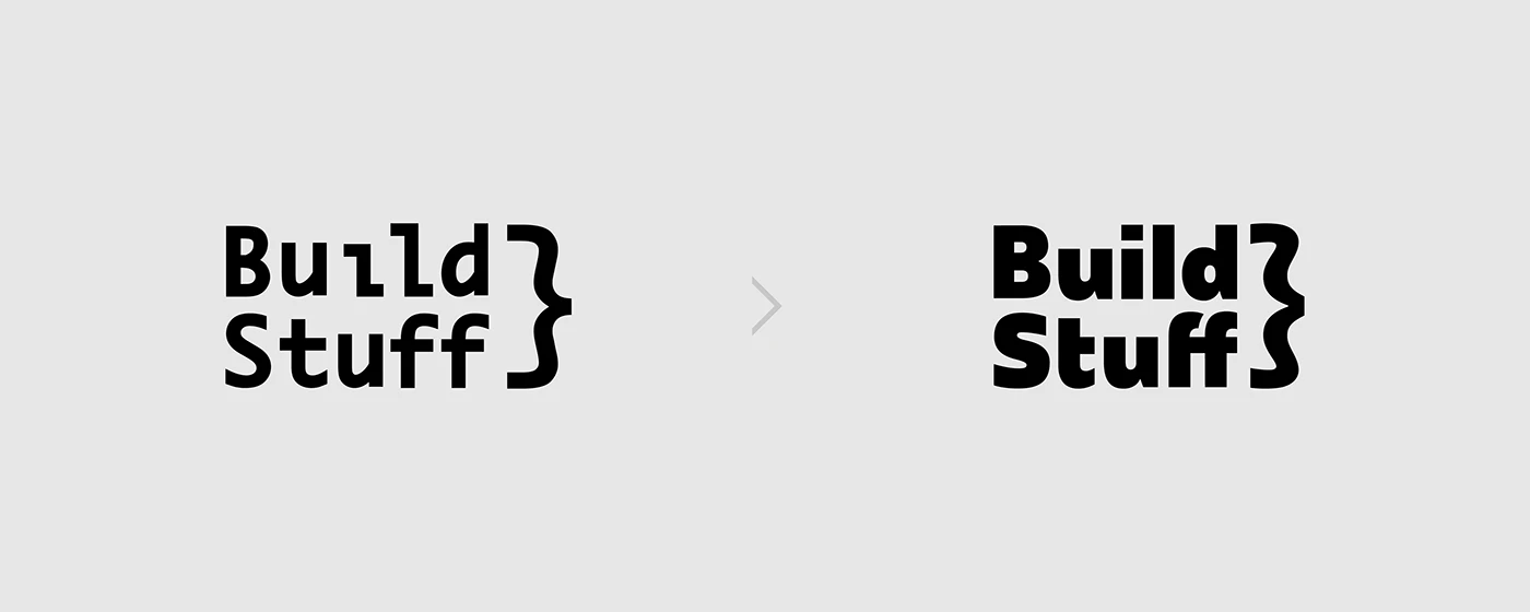
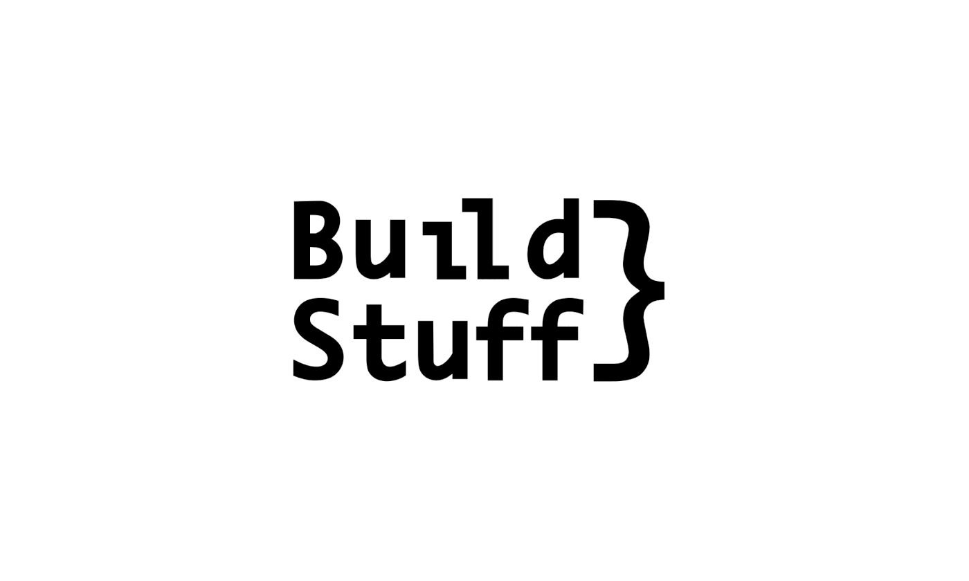
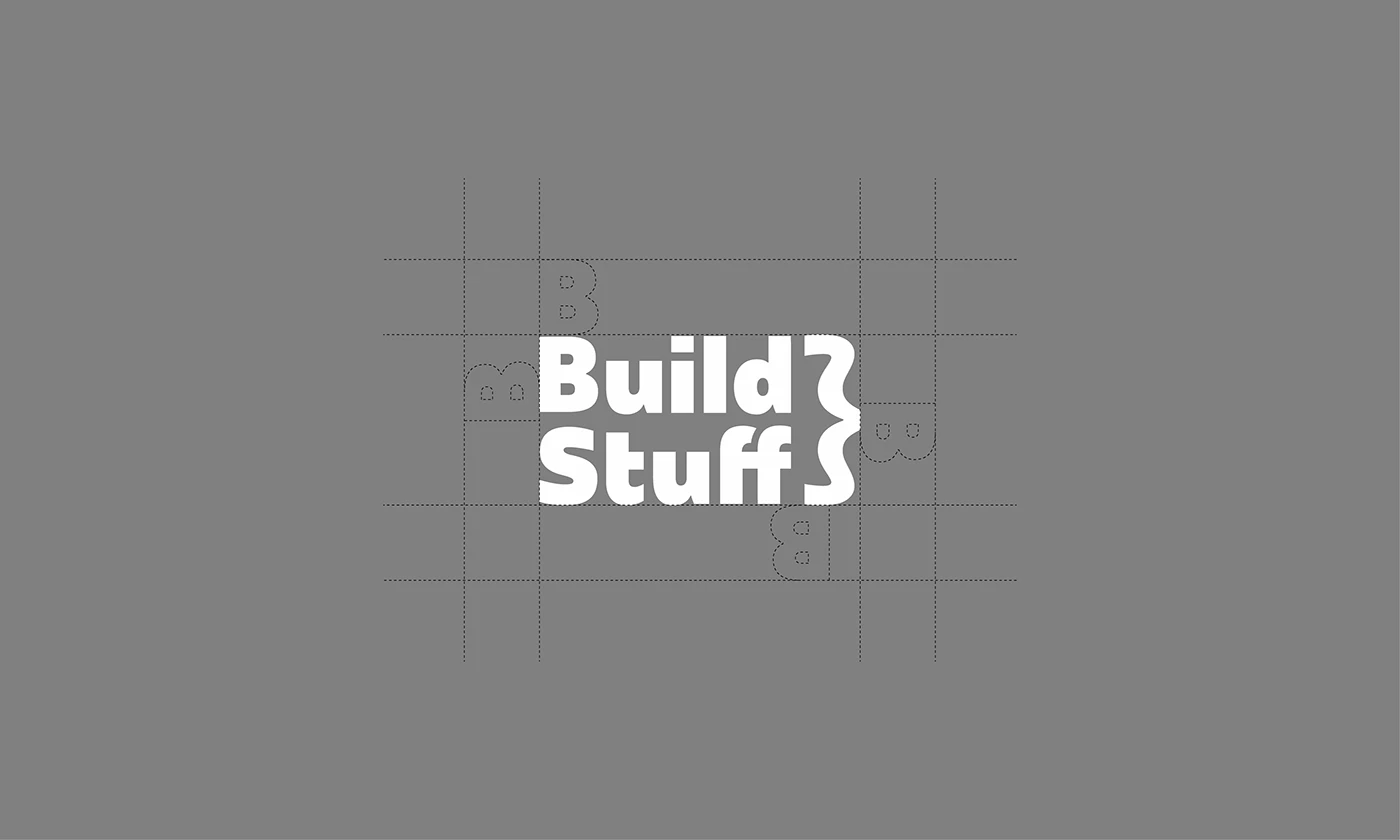
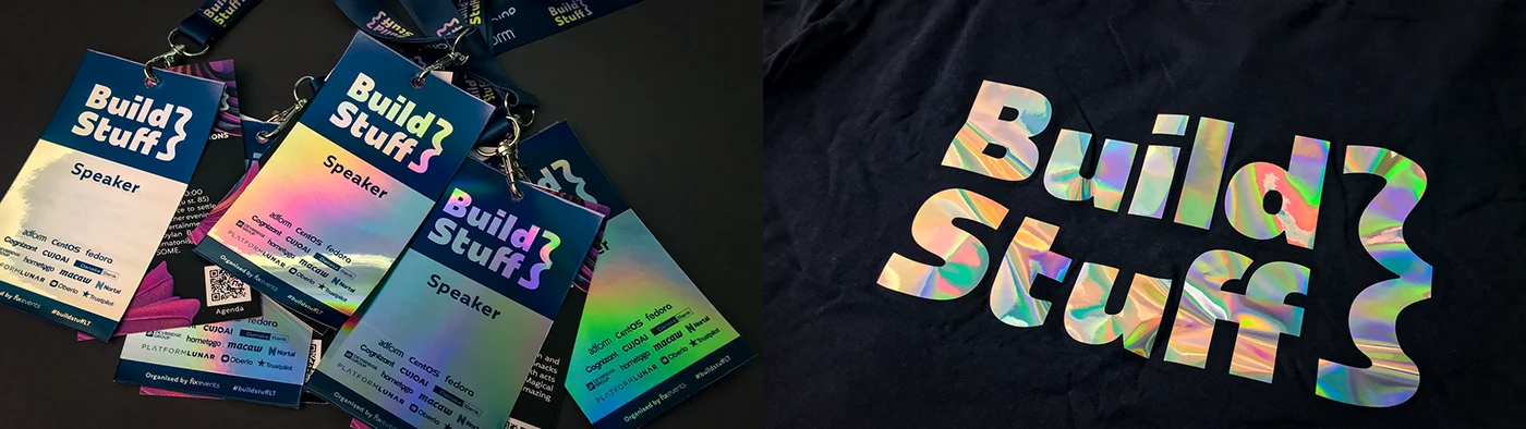
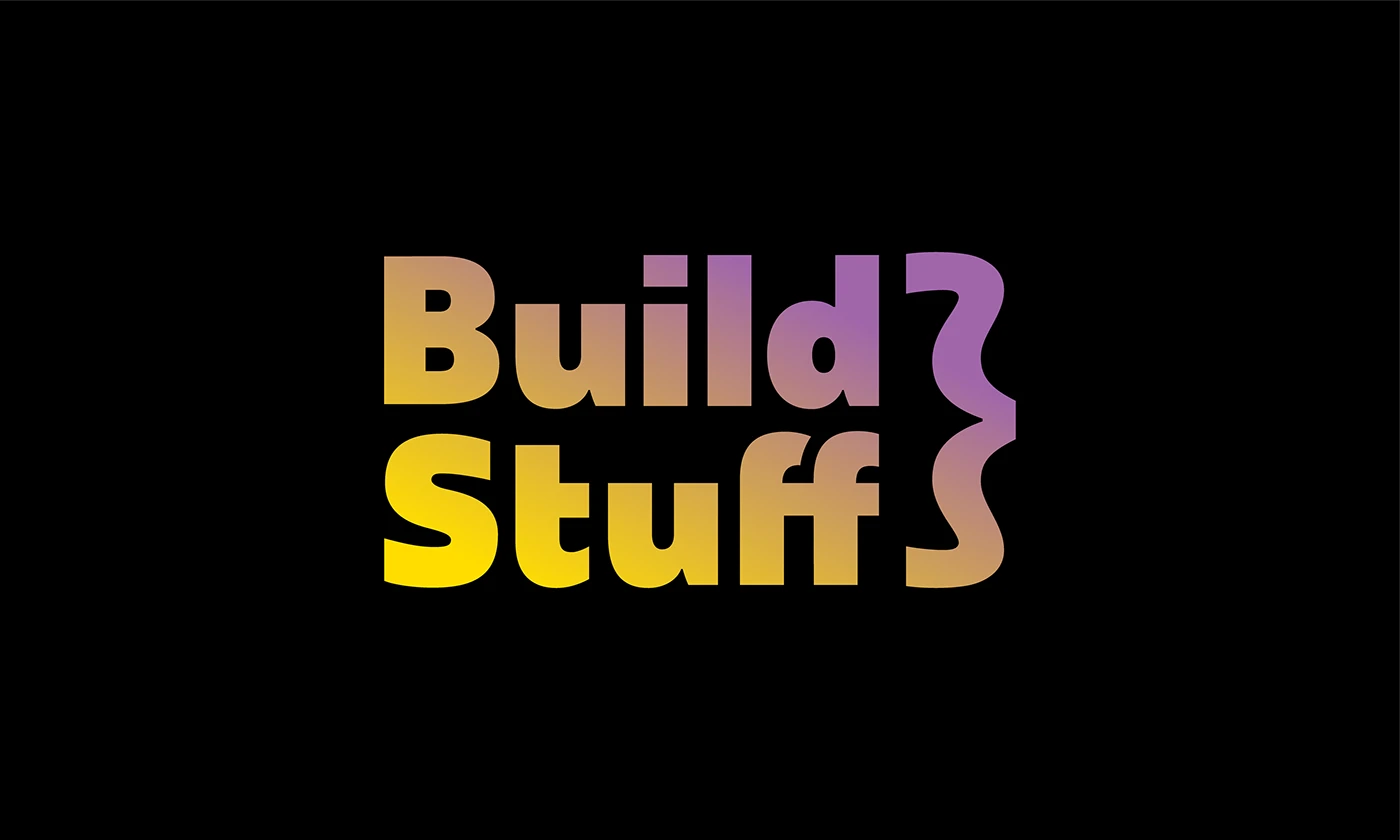
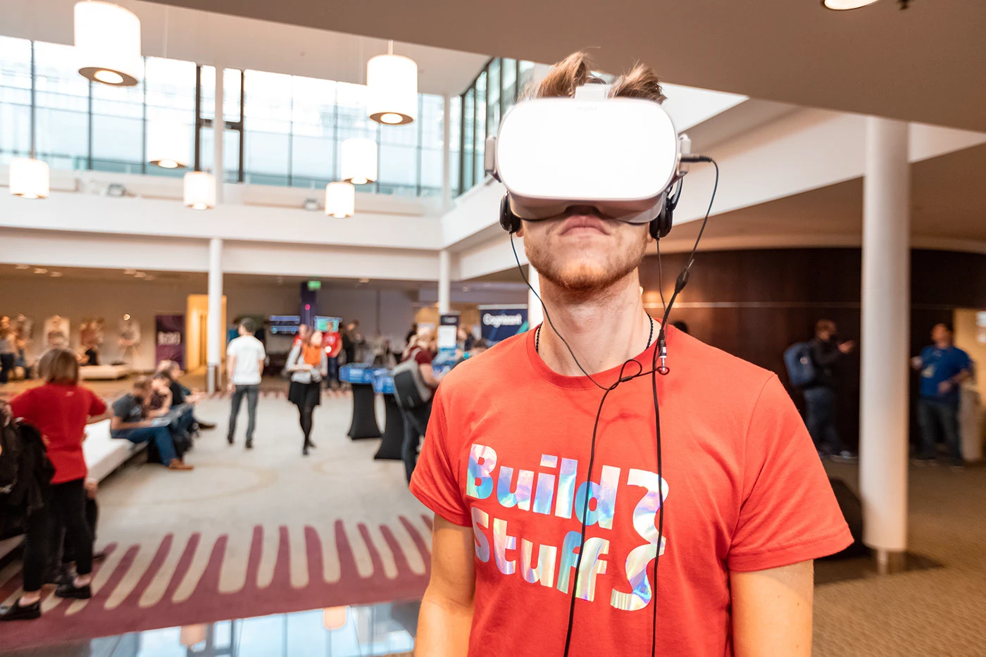
Build Stuff – Largest Software Development Conference in Baltics. The original version was created back in 2012. It was necessary to uplift the visual of a logo because it looked outdated. The letter “i” was missing a dot on it. Kerning was incorrect and a curly bracket was heavier compared to the body. Letters “ff” were separated, they were missing a smooth ligature. The solution was to provide a modernized and a bit heavier semi-custom typeface. It opened a window for a logo to be used on/with different patterns and/or colour varieties. Solution also gives a chance to customize a curly bracket each season to fit the different concepts of the conferences.
Creative fields
BrandingTypography
- Stats
- 33 appreciations · 916 views
- Owners
- Twelve Moons
- Published
- December 14, 2018
- Source
- Behance
Keywords
wordmarktypologoligaturebuildStuffbrandinggradienttypography